menu

moment energy
team
gina chang, seansky liu
my roles
user research, user interface design, visual design
timeline
july - august 2024 (4 weeks)

background
the task at hand
During my time at Moment Energy, I designed and built a scalable project gallery to help prospective clients navigate complex energy solutions. This interface acts as a strategic touchpoint, qualifying leads and facilitating a smoother handoff to the Business Development team.
problem
an experience that was too static for a portfolio that was expanding rapidly
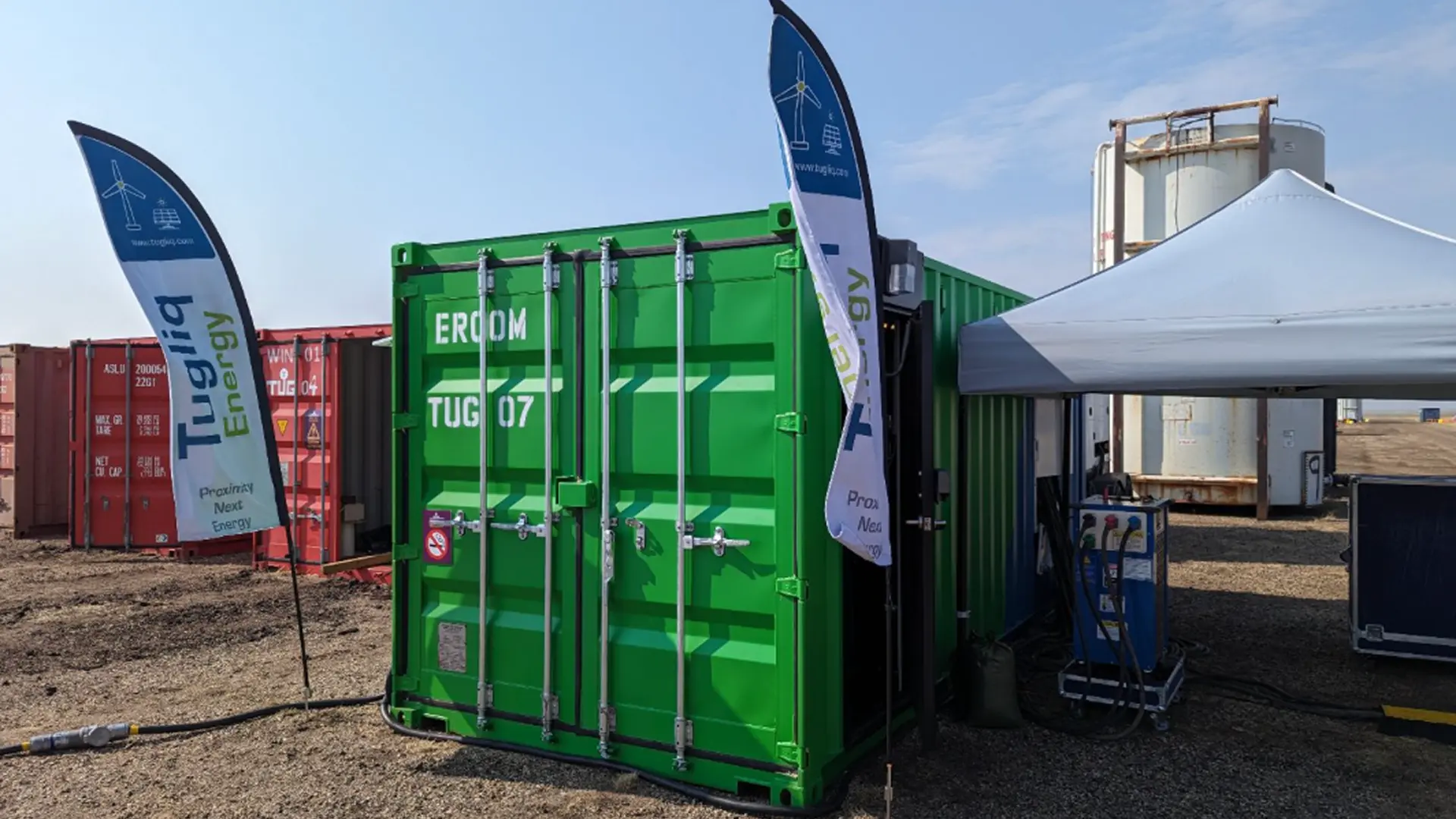
With the announcement of new project developments and deployments, I needed to create a streamlined web experience to inform and help prospective clients navigate their project needs. The two primary issues were:
outdated project information
lack of scalability
how might we…
create an informative experience for prospective clients seeking to learn more about Moment Energy's battery energy storage systems through past deployments?
part 01 - exploratory research
auditing the current experience through user heat maps
I started by conducting a deep dive into 12 months of user behaviour data using HotJar, an external analytics tool, to see what users were consistently searching for. By analyzing the interactions of over 1400 users between July 2023 and April 2024, I transitioned from anecdotal observations to data-backed evidence.
51.8%
of users scrolled to the end of the contact form at the bottom of the page.
8.6%
of all clicks were to browse through the project testimonials.
13.9%
of all clicks were to look through the first two projects.
KEY INSIGHT
Users required deeper project insights to build trust before committing to a lead form.
KEY INSIGHT
Users wanted to see previous client testimonials in order to gauge what their experiences with Moment Energy were like.
KEY INSIGHT
Users required in-depth project breakdowns, including technical specs and collaborative outcomes.
While the heat map data revealed what users were searching for, it did not explain how project information should be structured or presented. To better understand how successful firms communicated complex project details, I turned to competitor analysis.
competitor analysis
identifying best practices in technical storytelling
I analyzed the information architecture of competing firms to pinpoint exactly which project details drive client engagement. This benchmarking allowed us to identify gaps in our own experience and led to the development of three framing questions:

What information did our competitors provide in their project writeups?

How did our competitors compile information in a way that is easily browsable and navigable?

How did these websites lay out their project information and details without overwhelming the user with too much information?
Using these three framing questions to guide our analysis, I uncovered recurring patterns across successful project narratives that informed the structure and organization of our redesign.
part 02 - the redesign
reformatted the layout to function as cards within a modular grid system
Building on the insights gathered through competitor analysis, I redesigned the layout around a scalable modular grid system. This flexible structure allows the page to expand seamlessly as new projects are added while ensuring the growing portfolio remains easy to browse and navigate.

Initial modular grid exploration focused on scalability and browseability

reconstructed the project detail information architecture
The redesigned information architecture organizes project content into clearly defined sections, allowing users to efficiently navigate between project context, technical details, testimonials, and results.

results
overall improvements

replaced rigid legacy tabs with a modular grid for infinite scalability

leveraged 12 months of HotJar analytics to drive actionable UI enhancements

optimized scannability by reconfiguring the project information architecture

transformed a static gallery into a scalable, high-conversion sales tool
here's what i learned
Effective storytelling is not solely driven by visuals, but by the way information is organized and presented. Combining behavioural data with competitive research helped transform my assumptions into intentional design decisions.
next steps to take it further
Given additional time, I would validate the redesigned experience through usability testing to evaluate whether the new structure content improves content discovery and navigation efficiency. I would explore interaction patterns such as filtering, and project categorization to support the expanding portfolio.
designed by