Moment Energy
Creating a new project gallery experience aimed at informing prospective clients about our past deployment sites.
What is Moment Energy?
Moment Energy is an energy storage solution company that provides commercial-scale access to clean, affordable, and reliable energy storage by repurposing retired electric vehicle batteries.
With the announcement of new project developments and deployments, my team and I needed to create a streamlined web experience to inform and help prospective clients navigate their project needs. We needed to begin by addressing the current page that had 2 main issues:
How might we create an informative experience for prospective clients seeking to learn more about Moment Energy’s battery energy storage systems through past deployments?
Exploratory Research
User Heat Maps
Using HotJar, we took a look at data taken from a 12 month period spanning from July 2023 to April 2024 and from approximately 1.4k users.
51.8%
of users scrolled to the end of the contact form at the bottom of the page.
8.56%
of all clicks were to browse through the project testimonials.
13.94%
of all clicks were to look through the first two projects.
Driving Insights
Competitive Analysis
By observing and analyzing how competing companies laid out their information, we were able to better understand what parts of the project were most appealing to users and what they wanted to learn about the most. Our framing questions included:
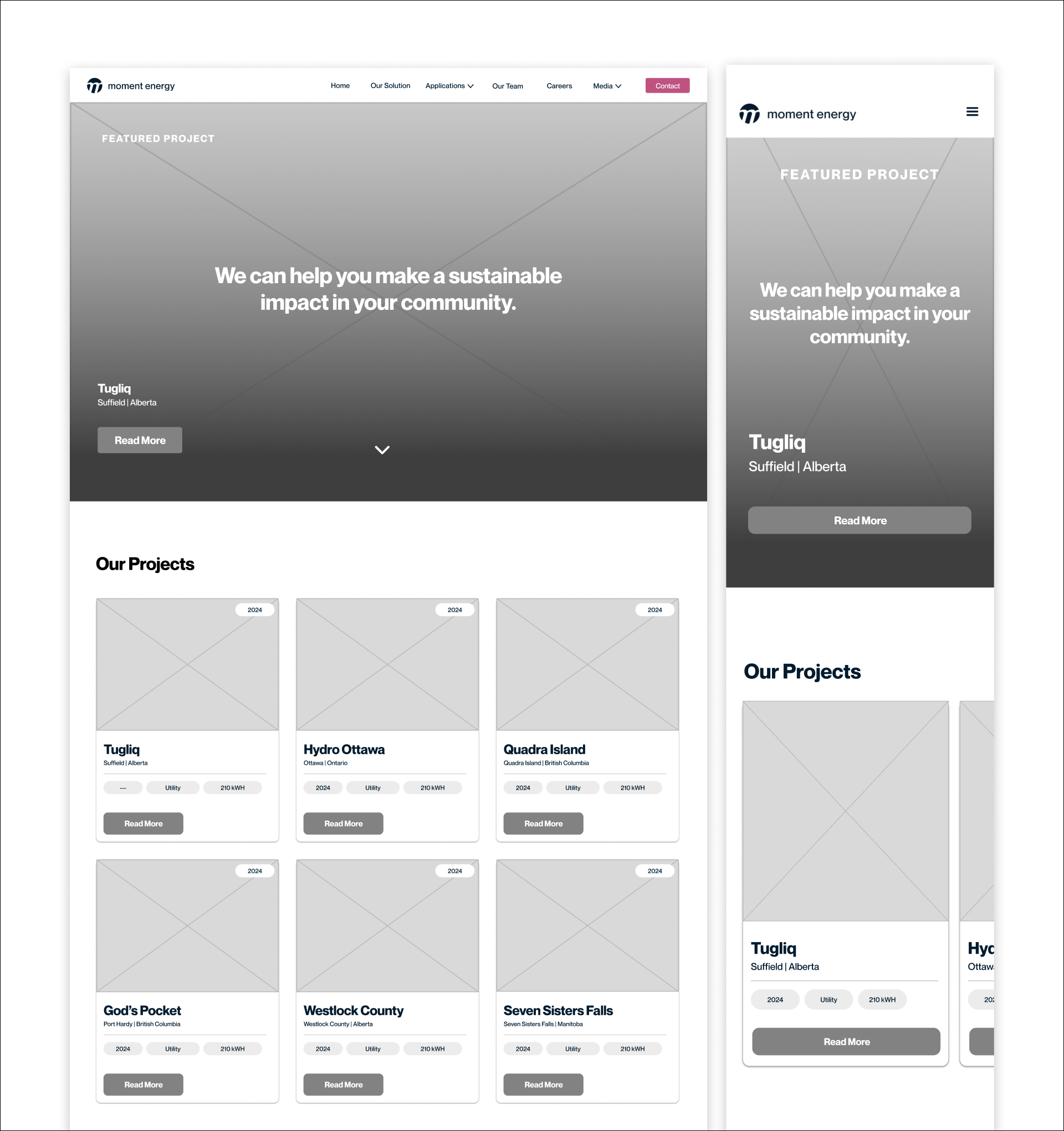
Wireframes and User Flows
With all of the preliminary research and competitive analysis in mind, we moved on to developing wireframes and user flows in order to see what content should be prioritized.

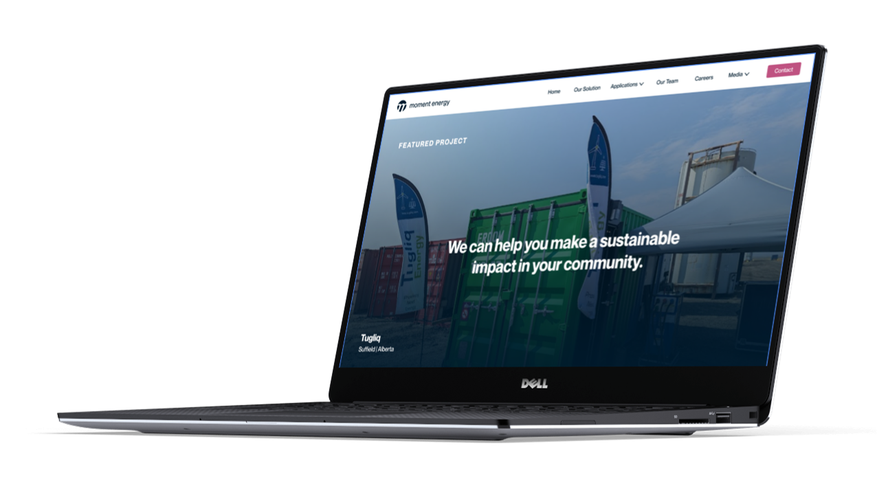
The Solution
We wanted to create a straightforward and easy to understand experience in order to reduce the friction between getting clients to understand Moment Energy’s product and helping guide them to a conversation with the Business Development team.
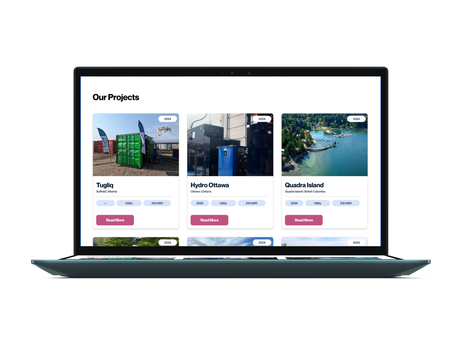
Key Features
Cards within a Modular Grid System
Users can browse effectively and efficiently through the modular grid with grouped information.
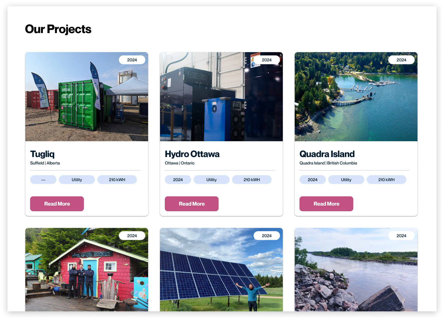
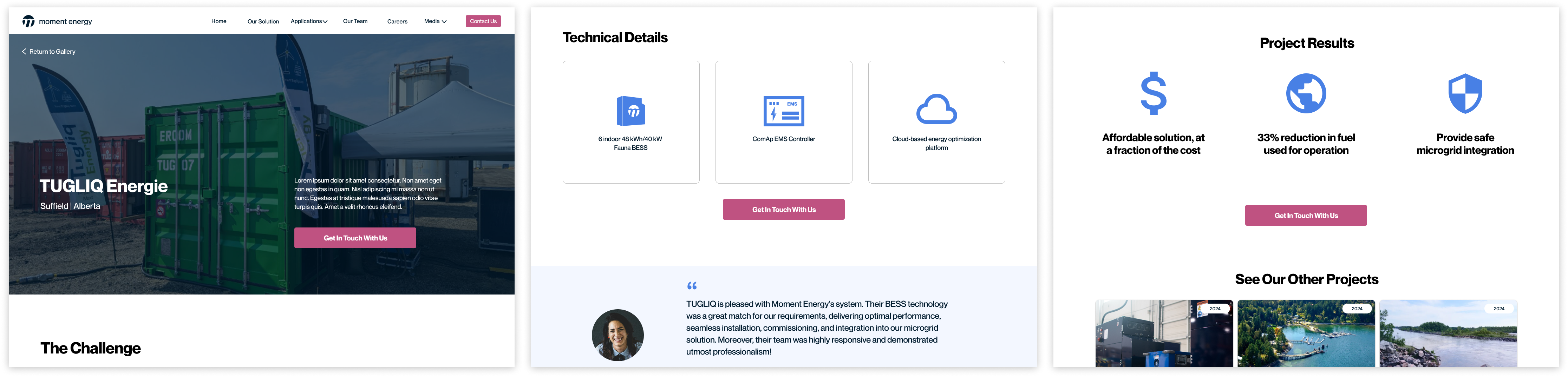
Reconstructed Project Detail Information Architecture
Prospective clients can skim through the information quickly to find what they are looking for.
Prototype
What's Next?
Final Takeaways
Working on this project at Moment Energy gave me the chance to spearhead, and oversee an entire design project from start to finish. I had the chance to learn how to present to stakeholders (including the 4 co-founders!) and though it was fast-paced, I found myself enjoying the challenge.
More Projects


